 Cross-browser compatibility is one of the main promises of the professional PSD to HTML conversion services. But there are 50+ different browsers now (5 are the market leaders, while others suit some particular users’ needs and preferences). Many of them have their own peculiarities in treating HTML and CSS standards and require using special tricks and additional coding to be taken into account. As a result, cross-browser compatibility may lead to the increase of costs and time on PSD to HTML conversion, as well as to the growth of size and complexity of the resulting markup.
Fast adoption of HTML5/CSS3, the mobile Web and such techniques as responsive web design introduce new aspects in evaluation of to what extent cross-browser compatibility should spread in a concrete situation.
In this article we have collected information about browser popularity, their support of the new markup coding standards and mobile devices, and provide a number of recommendations for customers of PSD to HTML services in order to stay within reasonable budget and wisely concentrate their efforts when converting designs into HTML/CSS code.
Browser Market Share Statistics
According to StatCounter’s browser market share statistics, Internet Explorer, Firefox, and Chrome are the most popular browsers today. The percentage is as follows (the figures are actual for October 2011):

StatCounter.com, Oct 2011: IE – 40.18%; FireFox – 26.39%; Chrome – 25%;
Safari – 5.93%; Opera – 1.18%
Though, the version popularity of a given browser is more essential when placing an order for the PSD to HTML slicing services. Here is the corresponding statistics for November 2011:

W3Counter presented a little different browser statistics but in whole the picture is close.
Please note: When considering the browser statistics, you should understand what data stands behind (see more in “How Browser Market Share is Calculated“). Also note that browser statistics varies regionally and through time.
Browser Support of HTML5 and CSS3
The specifications for HTML5 and CSS3 are still under development and are expected to be finalized by 2014, though the latest versions of many browsers already support some of the new features. Therefore, if HTML5/CSS3 is important for your website then before converting PSD to HTML it’s reasonable to check out which browser versions should be taken into account first of all.
The HTML5 test suite 2.2 rates the support of HTML5 by the leading web browsers as follows (September 2011):
| Browser | Test points (out of 450) |
| Google Chrome 14.0 | 340 |
| Mozilla Firefox 7.0 | 313 |
| Apple Safari 5.1 | 293 |
| Opera 11.50 | 286 |
| Internet Explorer 9 | 141 |
Another helpful resource that estimates browsers’ support of CSS3 and HTML5 features is FindmebyIP.com/litmus:

One more test designed to try-out primarily specifications for Web 2.0 dynamic Web applications is Acid3 (acid3.acidtests.org):

Acid3 test for Chrome 14.0.835
Desktop vs. Mobile
The mobile Internet is an increasingly growing phenomenon now. But in fact, its expansion and share strongly depends on the country. For example, in Germany mobile web provides about 2% of traffic, in the USA – about 8%, but in India it is about 34%:

According to IDC, by 2015 “the impact of smartphone and, especially, media tablet adoption will be so great that the number of users accessing the Internet through PCs will first stagnate and then slowly decline. Western Europe and Japan will not be far behind the U.S. in following this trend.”
Mobile Browser Market Share
Mobile browser popularity statistics is quite different in comparison with the desktop browsers and for September 2011 it is as follows:
| Browser | Market share, % |
| Opera Mini | 22.45 |
| Android | 19.90 |
| iPhone | 16.75 |
| Nokia browser | 16.01 |
| Blackberry | 11.64 |
Responsive Web Design vs. Mobile Versions of a Website
Responsive web design (RWD) is a vibrant trend now. It provides a form-factor adaptability across multiple mobile and desktop devices. This is achieved due to such techniques as fluid grids, flexible images and videos, and media queries.
RWD allows getting cross browser compatibility in its ultimate form when the website is displayed right in both desktop and mobile browsers. The difference in comparison with conventional cross-browser support is how the word “right” is treated. Now the website can both look almost the same in different browsers across one type of devices and detect the media in which it is opened and provide the website version that is optimized just for it, be it a smartphone, tablet or desktop. To be exact, this feature should be called cross-browser responsivity or responsiveness rather than just compatibility.
However, the reverse side of the RWD universality is more code to develop and subsequently update, longer development cycle and more costs on it, load time increase and some other problems (see more, e.g., in “11 reasons why Responsive Design isn’t that cool!” or “I Love Responsive Design, But…“). That is why a separate mobile version of a website is still considered as a reasonable option in some cases.
HTML5 and the Mobile Web
For mobile browsers the support of HTML5/CSS3 may be even more important than for the desktop ones. Mobile devices have such features as touch screens or orientation identification. Their manufacturers have developed specialized API’s (Application Programming Interface) – Touch events API, Orientation API, Geolocation API, etc., which are available to 3-rd party developers. The point is that these API’s are created in the close integration with HTML5 features.
In combination with the fact that HTML5 allows considerably improving markup coding and provides new possibilities in multimedia content processing which is essential for mobile devices, this all leads to a bright outlook of HTML5/CSS3 in the mobile Web and increasing its popularity among the website owners.
The HTML5 test suite gives the following figures for the support of HTML5 by the mobile browsers (September 2011):
| Browser | Test points (out of 450) |
| iOS 5 (iPhone4, iPad) | 296 |
| MeeGo/Harmattan (Nokia) | 272 |
| Opera Mobile 11.10 | 269 |
| BlackBerry OS 7 | 260 |
| Firefox Mobile 6 | 254 |
| Android 2.3 | 177 |
| webOS 2.1 | 155 |
| Windows Phone 7.5 (Mango) | 140 |
Most Popular Mobile Operating Systems and Screen Resolutions
The picture here is versatile and changeable and quite different in different countries. For example, for the USA:

Mobile OSs, Oct 2011, USA: Android – 39.78%, iOS – 39.77%, Blackberry – 11.13%,
SymbianOS – 3.17%, Samsung – 1.24%, Windows Phone – 0.83%
As for resolutions, to some extent the things are easier with iPhone (and iPad) devices based on the iOS mobile operating system because their form-factors are standardized. Nevertheless, the new display (so-called “Retina Display”) used in iPhone 4 and higher can depict more detailed images (according to Apple such a display provides the maximum details that the human retina can perceive). This is a reason why it may be preferable not to scale but to design a separate set of high quality images for devices with the Retina Displays.
The Android-based device market is much more diverse. The resolutions vary significantly among manufacturers and models here – there are a lot of devices with different screen sizes and screen densities (dots per inch (dpi), the quantity of pixels within the screen). To cope with such a variety, fluid layouts are widely used when designing websites for Android-based devices.
So, when planning responsive web design or ordering PSD to HTML conversion and defining which screen resolutions to put on the list first of all, it may be reasonable to find out the most popular devices among the target audience or at least on the mobile market.
Which Browsers to Mention Ordering PSD to HTML Conversion
Here are some tips to take into account when choosing options of the cross-browser PSD to HTML conversion.
- Region preferences are very important. For example, desktop Opera might not be taken into account in the USA but it should not be neglected for the Eastern Europe because Opera is very popular in those countries.
In the USA IE6 has taken only 0.94% in September 2011. But in China over 35% of web users are on IE6 (October 2011):

- If the website is to be used mainly by companies utilizing legacy software or some government or scientific organizations, then such a browser as IE6 may be a must too.
 The boxed comments were present on this website up to September 2011
- People who usually visit your website from their offices may use IE more often than those who browse your website from home or in the evenings, weekends and holidays.
- If your target audience is Internet active people (e.g., web designers), then you may omit such browsers as IE6 and old versions of other browsers because this group prefers the latest software product versions.
- Once your website is intended to work in a corporate Intranet and all users there have one and the same browser then there may be no need to order support of other browsers or even different versions of a given browser.
- Whether an important part of your site audience is people with special needs who use corresponding browsers and assistive technologies (such as screen readers) then of course you should take that into consideration too.
- If mobile users are essential, keep in mind that the mobile browser market is quite different in comparison with the desktop one. For example, Opera is one of the leaders here and, as a result, cannot be omitted anyway.
- Regarding how to make your website cross-platform and cross-device, you need to carry out a deeper research to figure out whether responsive web design or a separate mobile version is better. See an example of such a consideration in the article “Why Separate Mobile & Desktop Web Pages?” by Luke Wroblewski.
- BlackBerry and Windows Mobile based devices are typical for business people. If your audience is geeks, designers, and youth then you may concentrate on iPhones and Android-based mobile devices and corresponding screen resolutions (see, e.g., the table here).
- For Android it is reasonable to monitor top seller handhelds to determine the flagman devices on the market in order to understand on which resolutions (screen sizes and pixel densities) to orient firstly.
- Also consider making your website as more resolution independent as possible. For example, you may restrict using absolute units for font or block sizes.
- A valuable source of information about the website visitors’ behavior and preferences may be the analytical data for the previous website versions or other websites in the given niche. In particular, you can get additional info about demographics (countries, regions, cities, languages), screen resolutions, devices, operating systems, browsers, and even screen colors. An instructive example of such an analysis can be found in “Case study in best practice: An old guys guide to building modern websites“.
- If there are no special restrictions or requirements then it is reasonable to use a standard set of the most popular browsers and their versions (desktop): Chrome 10+, FireFox 5+, Internet Explorer 7+, as well as consider Safari 5+ and Opera 10+.
Conclusion
Summarizing, before converting the website design into HTML/CSS code or a WordPress/CMS theme
- Define your website target market and audience
- Analyze whether it is necessary to use HTML5, e.g., audio or video features, geolocation identification, etc.
- Determine whether responsive web design is pertinent for your website. If yes, specify main devices and screen resolutions
- Keeping this information in mind, check the latest browsers statistics, trends and forecasts related to them
- As a result, select browsers and their versions to take into account in PSD to HTML conversion
Try to use the latest data in your analysis. The browser market landscape is changing fast and to some extent unpredictably now, so statistics become obsolete quickly. Moreover, wisely separate the husk from the grain and the hype from the hope considering the latest buzz about new tendencies in order to make a sound decision.
Hope these tips will be helpful and provide at least some guides into the seething browser market when ordering the cross browser PSD to HTML conversion next time.
Additional Resources
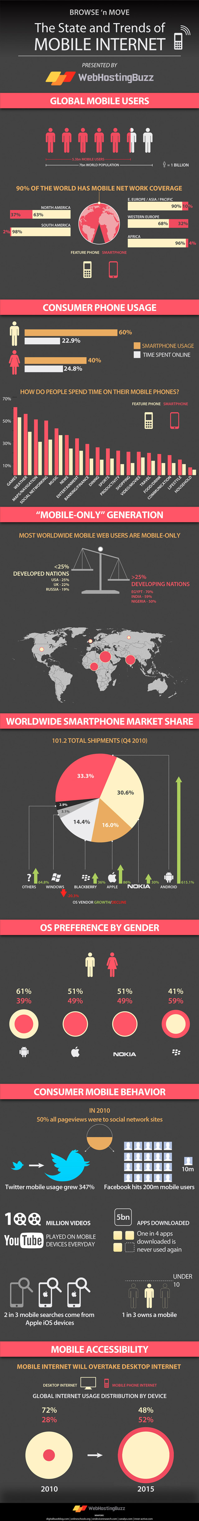
Infographic: The State and Trends of Mobile Internet by WebHostingBuzz


Pingback: PSD to HTML Conversion » The Cross-Browser Website – How Compatible Should It Be in the Era of Mobile Web?
I really like your website.. extremely great hues & theme. Did you create this internet site yourself? Plz reply back again as I’m looking to create my own web site and would like to know where u obtained this from. many thanks
diablo 3
This is exalcty what I was looking for. Thanks for writing!
Liberty
Really informative post. Thank you!
Website Hosting